2025 NAIWE Book Cover Design Winner

 Author: Mary Jumbelic
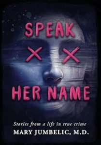
When first looking at the book cover, the contrast of the red with the dark background gives off a spooky feeling. A light, near-white outline of the woman’s nose and left cheek bring attention to her face. The first word of the book title is placed on the woman’s forehead, making it look like she has been branded. But this woman cannot see or speak because an X is placed over each of her eyes and the final two words of the book title acts as tape over the woman’s mouth.
The title of the book Speak Her Name and the placement of the words of the title on the cover are at the very essence of what this woman cannot do and provide an excellent foreshadow for what this book is about.
Comments from professional book designer Tamian Wood:
“The x’s over the eyes tell the reader, at a glance, that there is death involved in this story, even before we read the words. Also, the striation in the image that suggests clear tape over the eyes and mouth has a super creepy, murdery vibe.
“But what I particularly like about the title is that each letter is unique. With a standard font, a repeated character will look the same because there is typically only one version of each letter. In this case, all three of the E’s are subtly different, as are the A’s and X’s. Great attention to detail.
“Another subtle, but really cool touch is the slight pinkish tint to the upper eyebrow and below the nose of the central character, picking up the color of the font and tying the two elements together in an artful and harmonious way.
“Overall, nicely done.”
Congratulations, Mary Jumbelic’s Speak Her Name for being a NAIWE 2025 Book Award winner!
Leave a Reply